

I started with a deep dive into the competition by identifying three top online meeting services that market their product as a solution to connecting remote teams.

While these services provide standard communication platforms that are fairly easy to use, I noticed that an interactive element is missing to create a more collaborative work environment for remote teams.
Exploring the competition helped me better understand the problem space of online meeting tools, but before I could jump into finding a solution I had to understand the people who use these products.
I sent out a screener survey to establish a foundational understanding of my target audience.
Users predominantly worked in a physical office (59%), followed by remote workers (53%)
50% of users reported to meet with their colleagues via online meeting platforms once a week
Users predominantly participated in team meetings (74%)
Users favored Face-to-Face (59%), Instant Messaging (59%), and Email (56%) communication over Video Chat (31%)
I conducted 30-minute user interviews with six individuals who shared their experiences using online meeting tools in their current or recent employment. When asked to describe the most important features of online meeting tools, the highest responses included:
I like having multiple avenues to connect with people
I love the efficiency and how quick communication happens
Video chat is not a replacement for being in the room with your colleagues
It’s difficult finding an easy way to get the [online] meeting started
The key questions, ideas, and notes that I had collected from my user interviews were grouped together in a variety of post-its and molded into a linear user story which described the user experience of interacting with online meeting tools. It told a story of the frustration, confusion, awareness, and comprehension of users interacting with these tools.

The primary insights I gathered so far from my research which influenced my understanding of the problem space of online meeting tools included:
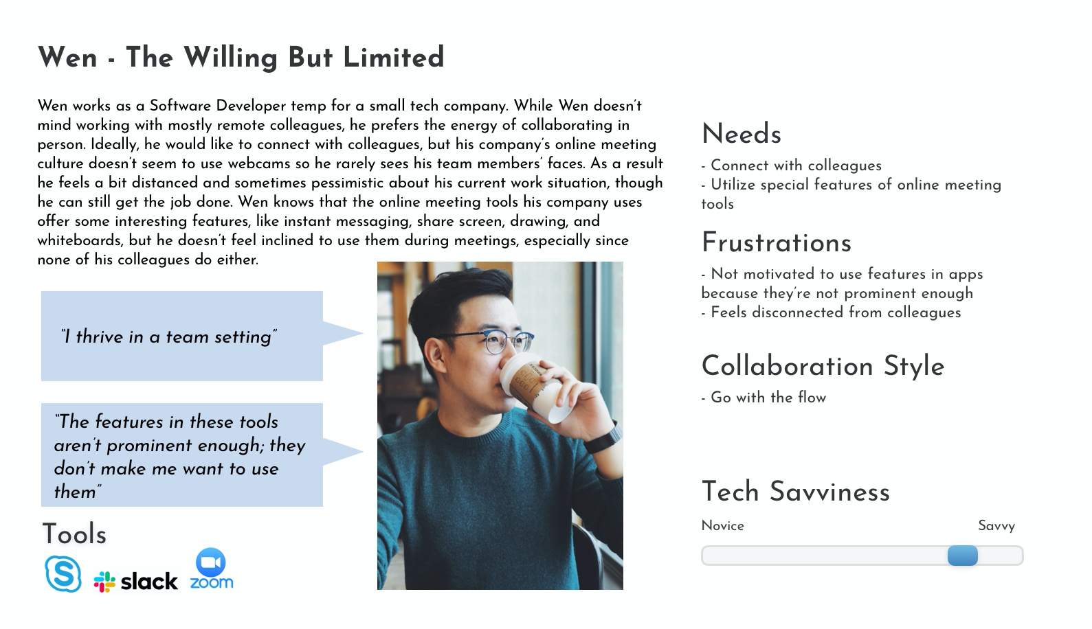
I then generated three personas based on three key sets of user experiences and issues that I identified in my interviews. It was important to consider these various perspectives in order to find a user-centered solution to the problem at hand.
I used these personas to help me empathize with the feelings of frustration some users feel when using a difficult tool (like Tara), the joy of connecting with colleagues (like Erica), and harnessing the passive interest of some users (like Wen) who just need a little push to maximize their experience. Considering the different needs I had identified in my personas led to more mindful decision making on my part to ensure users were front and center in my design work.


To find solutions to this problem, I needed to ask the right questions. So far, I gathered relevant information on the issues users experience with online meeting tools, and cultivated an empathetic understanding of user needs.
Thinking about the big picture, I formulated several “How Might We” problem statements to get to the heart of what users need in their online meeting tools:
All the above research combined helped me create the foundational designs for my online meeting tool.
Putting pen to paper, I sketched out a variety of potential designs for my collaborative meeting tool. I eventually settled on a design that I thought captured the user needs I had identified in my personas:

To help stay aligned with user needs, I wrote User Stories which identified the essential features of my product that help users achieve their goals:
I created a user flow diagram to show “red routes" (or primary tasks) that users would take in CO to successfully run an online meeting.

Now it was time to bring my project to life by sketching out my design with a focus on the red routes I had identified. I conducted five guerilla usability tests using a prototype version of my sketches to collect quick feedback on the functionality of my design.
Results from the initial guerilla tests confirmed:
This feedback led to some major design changes in order to improve the user experience.

Next up was transforming my sketches into digital wireframes to better represent my designs and how users interact with the product.


Before I could transform my wireframe into a high-fidelity prototype, I needed to establish the visual design language of the final UI. I wanted Co to be a minimalist professional tool that brings remote teams together.
The Mood Board I put together features a variety of images and illustrations which demonstrate the design elements I wanted in Co, primarily the use of pastel vs. bold color contrast, lots of white space, and a modern office aesthetic.
I combined these elements into a Style Guide to visualize the overall artistic direction for the prototype. The guide combined a muted pastel palette, simple rounded icons, buttons and fields, a bold yet minimalist typography (Futura and Avenir Next), as well as clean lines and a generous amount of white space.


Two rounds of moderated usability tests were conducted with five participants in each round. Participants were asked to complete a series of tasks which demonstrated the red routes I had identified:
The initial testing sessions showed users’ perception of Co as a collaborative online meeting tool, often comparing it to Zoom or Google Hangouts Meet. Participants noted that what set Co apart from similar meeting tools was its interactive features, specifically the Whiteboard function. Testing revealed several key functionality issues with the prototype, primarily naming conventions and lack of feedback to users after completing particular actions. This user feedback was pivotal in generating better design solutions.
The major changes I made to the Co prototype after the first round of usability testing involved communicating feedback to users after they had completed an important action. For example, several users had asked whether the recipient of the meeting invitation in the test had actually received an email confirmation. Other users expressed their concern that the Whiteboard project would be lost upon clicking the “Leave” button upon exiting a meeting. Both these examples highlighted the importance of providing confirmation to users to communicate task completion.
Users are greeted with a clean welcome page with prompts to log in or immediately join a meeting. (Illustrations: undraw.co)

The user homepage shows a personal dock with up upcoming and past meetings with options to join a current meeting or schedule a new meeting.

The meeting room offers a simple video interface with interactive features such as instant chat, note-taking, recording, and share screen.

Whiteboard mode is an interactive space where users can collaborate on projects in real-time.

Users can easily share their whiteboard project, meeting notes, and recordings with colleagues who missed the meeting.

The results from the two usability tests showed positive receptions of Co as a user-friendly, sleek online meeting tool for team collaboration.
Key user flows such as scheduling a new meeting on the homepage, starting a meeting, and saving a Whiteboard project were completed by participants as anticipated, although several areas for improvement were also identified. For example, several users expressed confusion regarding meeting codes which are intended to provide quick access to meetings (i.e. the user enters code and is directed to the meeting room, foregoing the need for a meeting invitation). While meeting codes are typical in other online meeting tools, such as Zoom, by relying on user-recognition I introduced a confusing and possibly unnecessary element to the product that I would now consider removing.
Overall, this project allowed me to explore the UX research and design process from start to finish. By creating Co, I undertook an applied learning approach to understanding user behaviors and how this information is translated into design.
Let's chat about anything design, research, monkeys—you name it.


